It’s said that what you really need to know you learned it in kindergarten. Can you say the same for packaging designers?
Because it’s spring, we tried to use a simple child activity, colouring eggs, to solve some of the outlandish problems found among who creates the design and the printing itself.
Shown below we list three lesson to learn regarding colours in packaging from the annual Easter egg hunt, published on Packaging Digest’s site.
1- Why do you need black in colour print?
If mixing cyan (blue), magenta (red) and yellow permits to create every possible colour, black included, why do printers need black ink?
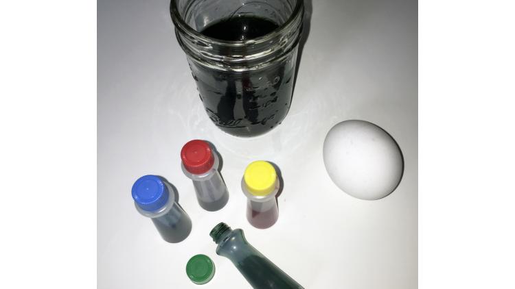
The experiment:
We created a black tincture with equal parts of cyan, magenta and yellow, beginning with the latter. We then immersed an egg in the tincture for roughly twenty minutes. Will the egg turn black?
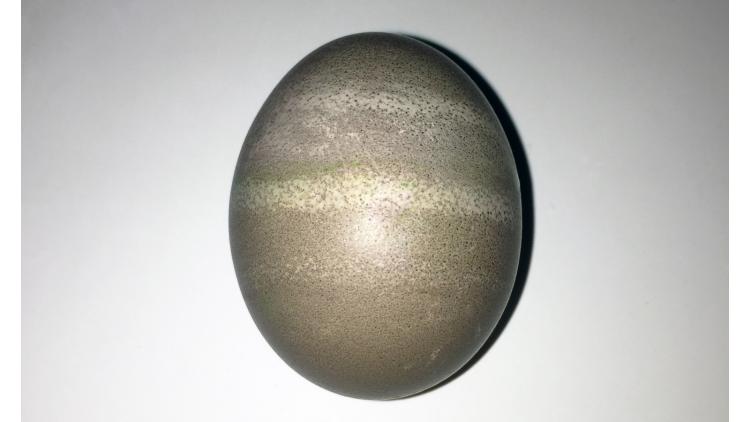
This colour is surely not black. Maybe olive green? Brown mauve?
What did we learn?
Mixing primary colours in different combinations you can obtain the entire colour spectrum; mixing two primary colours will obtain a secondary colour, and it’s what printers use to create every shade. When they print on a white canvas, every colour absorbs (or subtracts) its opposite from white light.
So, if we really wanted to paint an egg black, what should we do? We could use a great quantity of cyan, magenta and yellow, or (and this is the best solution) add a fourth colour, black: it’s cheaper, helps neutralize images and graphics and add density to shadows.
2- Substrates can be coloured
You specify perfectly your design, but when you receive the printing draft the colour is not what you had in mind. What happened?
The experiment:
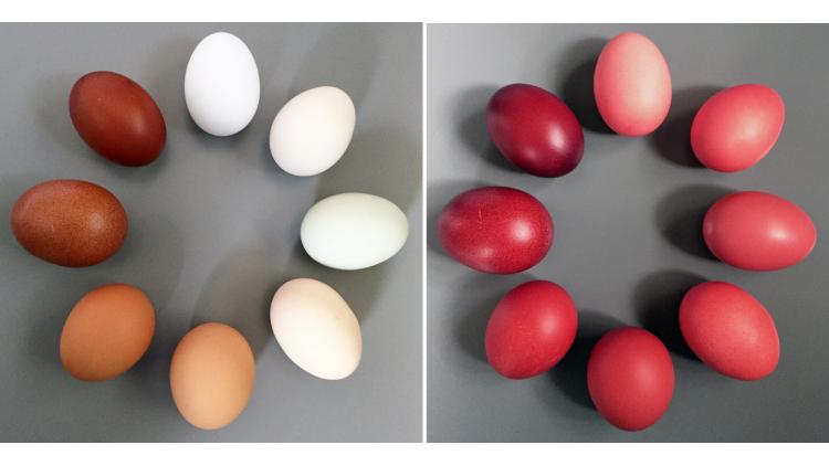
We took some different coloured eggs: to see how different shades react to ink, we submerged them in a pure red tincture for exactly four minutes.
Do they all have the same red shade?
What did we learn?
The substrate colour plays an important factor into deciding the ultimate colour of the egg. Instead of red, each one has gained a different shade of orange or brown.
This is an often-overlooked fact that plagues designers and printers everywhere. When you specify a colour and ink, you must consider the colour of the substrate. Red tincture or ink will look red only on a white background.
Our example is obvious, but even a tiny variation in the background colour will influence the final result. It’s something to consider if you want to print the same design on different substrates.

3- The colour communication is subjective
You want your printer to create “spring colours” for your box. How do you know their idea of a spring colour is the same as yours?
The experiment:
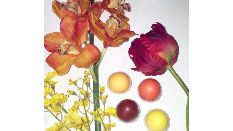
Using a little device for colour recognition, we measured the colour of spring flowers with stunning shades and found the equivalent Pantone colour. We then used the obtained data to mix yellow, orange and red to have a tincture for the eggs. Mission accomplished.
What did we learn?
It’s common for designers to use surrounding colours as an inspiration, describing them later to printers using a subjective language that printer can’t understand. Sunny, peachy, fresh and springy are not colours that can be found in the colours database. Not establishing clear expectations will result in a job to be redone when the “spring colour” the printer created isn’t the same sunny shade you had in mind.
Make sure the printer understands what you’re expecting. There are many ways to specify colour, including spectral measures, pantone books and Munsell standards.
Surely we know there is more than specifying, communicating and printing colours than what we learned in kindergarten. Sometimes, though, go back to the bases can help us to understand better what we ought to know.
Source for the article on Packaging Digest.