According to a recent research done by CEB marketing, 72% of customers think that the content of the site they are visiting is completely disconnected from what they want and need and only 14% of them actually valued a relationship with the company and its brand: what can we do to improve the overall user experience.
When irrelevant content is displayed, visitors leave. It’s that simple.
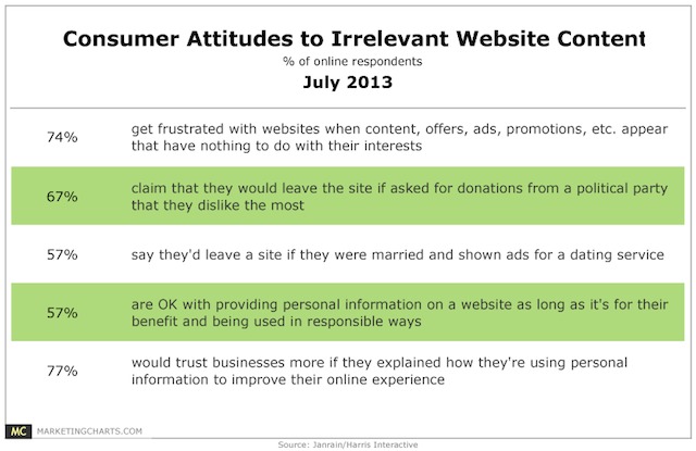
A 2013 study by Janrain and Harris interactive evidences that 74% of customers get frustrated when a website displays content that has nothing to do with their needs, like irrelevant advertisement or promotions.
It all starts with a good first impression.
Did you know that first impressions are formed in a fraction of a second, and that it takes around 2.6 seconds for a customer’s eyes to scan an entire online page and reach the area they’re supposed to focus on?
According to researchers at Missouri University of science and technology, participants stated that the three top features in their opinion were pleasant colour, contrast that made type easy to read and an appropriate main image.
![]()
Participants also spent time to look at the logo, the main navigation menu, the search box, the main image, the social icons, the written copy and the bottom of the website: how much effort are you putting on these elements?
This is where services like SessionCam or ClickTale are useful, letting you see heat maps and session videos.
UX doesn’t start on your website, it’s part of a larger journey
There a lot of things that can happen before the customer ever arrives on the website that can lead to a inefficient and frustrating UX:
- How much the company spent on understanding their market and target audience
- How well they targeted traffic
- How well they used their traffic data to determine their strategy to get your attention
For who is in charge of the UX, understanding the path followed by the user can help connect the gaps between the click from the traffic source and the landing on the website.
It’s important to not forget the small things that can help visitors towards a goal
Remember to understand how micro-conversions play a role, divided into two categories: process milestones (conversions that stand for movement toward a primary macro conversion) and secondary actions (not primary goals but still desirable actions).
Process milestones: what can add up to the macro conversion?
- Time on page
- Scroll depth
- Number of pages visited
- CTR to key pages
Examples of secondary actions:
- Watching the explainer video
- Visiting the FAQ area
- Playing with an interactive widget
Testing with real people
You can use platforms like YouEye or UserTEsting to see exactly how visitors are responding to the changes brought to the site; it would be ideal to use video user testing at both the beginning and at the end.
Want to read the entire article at conversionxl.com? Click here
Would you like us to help you with your UX issues? Contact us!