When is a design flawed? Most of the time is when there’s too much or not enough going on: there are a lot of elements you can use, but knowing which elements to use, when, and how much, becomes a problem.
The different elements at your disposal
There are a lot of different outlets of web design that designers can use: deciding between them really boils down to the understanding of the style, effect and tone of each element and how they relate to the core ideas behind the website.
Photography
A well-composed photograph situated in just the right area of a website can really make a design shine. Take the art blog ThisIsColossal as an example:
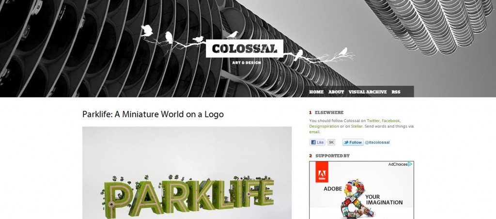
The header relies almost exclusively on the photograph, which effectively anchors the rest of the page with the addition of a nice text and logo that supplies an elegant contrast to the design.
Sketches
For a while sketches were huge in web design, providing a well needed relief from the standard solid colour of most web designs; now they are a bit more common, but they still work very well depending on the type of site you have and the aesthetic you’re aiming for, usually giving an informal feel to a design.
Kunal Chhajer’s portfolio is a clear example of sketches incorporation into design.
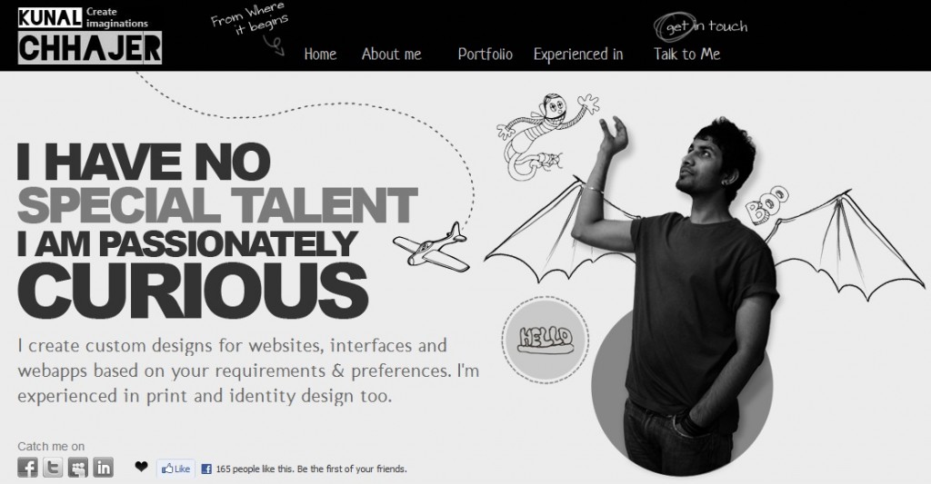
You can see how it presents a good mixture of script and non script fonts with sketch graphics and photography: some textures stand out while others blend, so texture is often misused or incohesive. Mel Kadel’s portfolio provides a clear example of the use of a texture that pops:
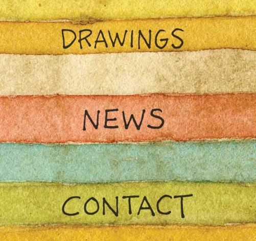
Watercolours give a wealth of texture to a design because their consistence is uneven and the can easily reveal the texture of the paper itself: the pattern and links are all very straightforward and careful to not overload the viewer.
Detailed typography
The type of fonts you have at your disposal is something to be aware of: some designers will even scan their own script to incorporate into a site. The best advice is to use a typeface that is in line with your site and design concept. Kuba Dabrowksi’s photography portfolio is a great example of how to use typography in design.
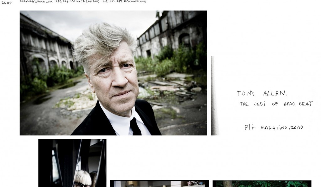
Photography portfolios typically are drawn to creative or experimental typeface choices. Because most of the site is images, the typography can be a bit more ostentatious.
Clean, minimalist
Sometimes the most effective and understandable sites are the ones that don’t confuse the brand or get in the way of content. Brilliant design details and effects can be exciting and showy, but most sites just need a design that doesn’t overpower their message.
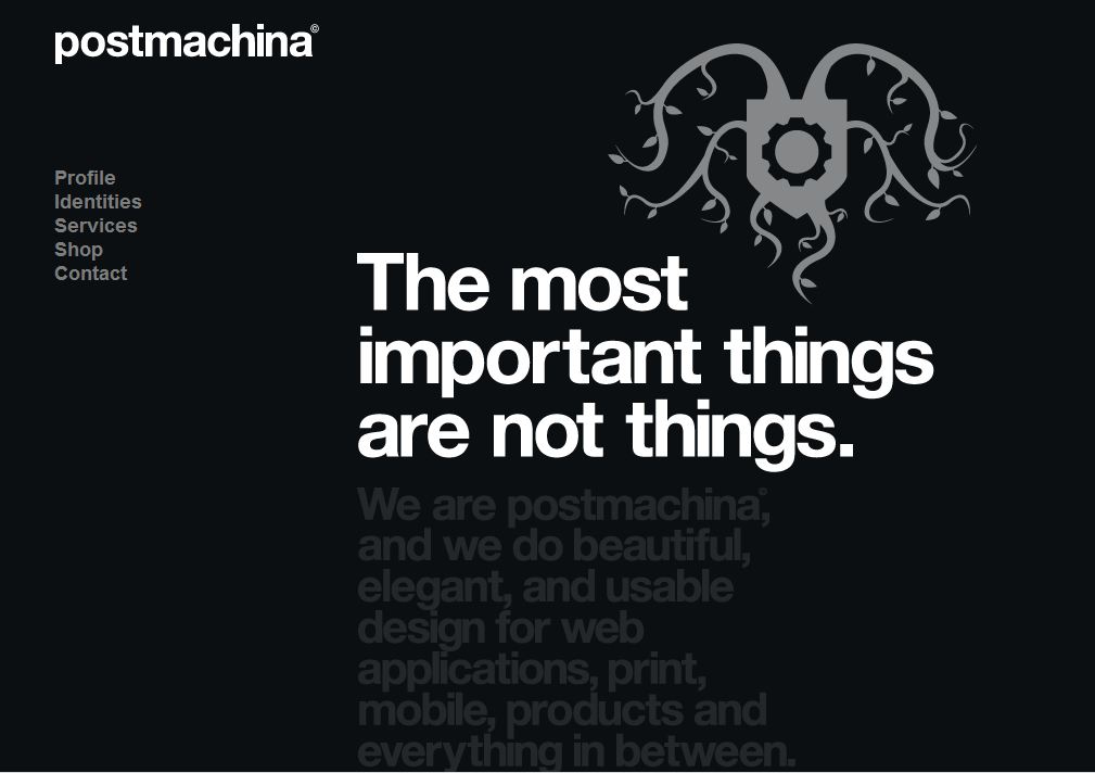
Postmachina is a design company with a clear and direct website: the front page is all monochrome, just black, white and shades of grey. Given that the site effectively uses shades and space, differences in texture or colour between the two columns of content.
Incorporating elements into your own design
A pivotal step is deciding whether the site you’re creating is intended to have a loud, showy design or a modest one: regardless, the best course is to start with a minimal design (if the client wants more flare, you can always add some texture or experiment with fonts) because it’s much more difficult to strip ideas from a working design than it is to add ideas to one.
If you’re having any doubts or if you’re looking for someone professional to aid you in this process, we are here to help!